Brand Guidelines Staff Edition. Version 1.0
|
|
|
- Rosa Atkinson
- 5 years ago
- Views:
Transcription
1 Brand Guidelines Staff Edition Version 1.0
2 Contents 1 An introduction to Lancaster University 1.1 Using the guidelines 1.2 A history of the brand 1.3 Tone of voice 2 The University crest 2.1 Primary logomark 2.2 Reversed out logomark 2.3 Mono logomark 2.4 Protecting the logomark 2.5 Minimum size 2.6 Logo for promotional materials 2.7 Misuse of the logomark 2.8 Crest colour palette 4 Photography 4.1 Photography City and Campus Buildings People Portraits 5 Digital communications 5.1 Social media 6 Templates 6.1 Templates 3 The University look and feel 3.1 Typography 3.2 Primary colour palette 3.3 Secondary colour palette 3.4 Branding hierarchy 3.5 Curved corners 3.6 Paper stocks 2

3 1 An introduction to Lancaster University 3
4 1.1 Using the guidelines The name and basic identity elements of any brand are among its most valuable assets. For this reason, all aspects should always be treated carefully and conscientiously. The strength of the Lancaster University brand image relies on its consistent visual expression and its application. These brand guidelines have been created to explain the basic principles for the correct application of the Lancaster University brand. They are intended for any staff producing or commissioning any Lancaster University branded communications. It is important that these brand guidelines are always adhered to in order to achieve a unified image that expresses the brand consistently and accurately. This will strengthen brand awareness and help Lancaster maintain its Top 10 University status. A logical and mindful approach should be taken when following the rules within these guidelines. There will be some specific and important situations in which the best application of the brand requires the development of a different approach, and this should be discussed with the Marketing Team. marketing-services@lancaster.ac.uk 4
5 1.2 History of the brand The University conducted research into its brand in the spring of 2014 which, firstly, helped it to develop a stronger marketing proposition and, secondly, sought the views of high achieving A-Level students on the type of visual branding they expected to see in a top ten university. The students polled had a very strong inclination towards shields, which they associated with history, tradition and high academic standards. The brand, then known as the swoosh logo, was felt by the students to look too corporate and that it said nothing about the University. This view was also shared by the majority of current students and staff. In April 2014 the new University crest was launched. The new crest helped to tell a story about Lancaster by featuring three wavy lines referring to the river Lune, two roses which are taken from the arms of the county of Lancashire and finally the open book which represents learning and knowledge. The brand has now been running for almost four years and has been very well received and recognised within the sector both in the UK and abroad. 5
6 1.3 Tone of voice Our brand personality is not just reflected in the look and feel of our communications, but also in the words we use. With the right tone of voice, our communications will be clearer and more persuasive. But, more than that, they will also create an impression of who we are, what makes us different and why students should study here. So whatever the media or message, our writing should be: Relevant The first question should always be: who is your audience? School leavers? Parents? Colleagues? Think about their priorities and what they already know. The finished copy should be informative without being patronising, giving answers to their questions. Also consider the context. The same language won t fit (physically or tonally) on a personal and a bus stop poster, for example. Knowledgeable There is never a need to dumb down our communications. We are one of the country s finest educational institutions. Why hide it? But being clever and being clear are not mutually exclusive. We may deal with important ideas at the leading edge of our various fields, but we should be capable of expressing those ideas without reverting to impenetrable technical language or jargon. 6
7 1.3 Tone of voice Open We want people to visit, stay and study with us. But for many of our readers, a University can seem like a daunting and distant organisation removed from their world. So whatever the particular message of your communications, our copy should always be open and welcoming (just like us). False or forced friendliness is not our style, but we can and should be warm and conversational in our communications. Engaging Copy should be both compelling and easy to read. That means keeping things simple: have one idea per sentence and one topic per paragraph. But mix up the length and structure of your sentences and paragraphs when things are uniform, they re boring. Reading a succession of long sentences is like running a long race while holding your breath. It s exhausting. Short sentences offer a break. And they re a good way to end things. Proud Around 50 years ago, Lancaster University was barely more than an idea: we held lectures in a former church and put students up in an old factory. We ve come a long way: a top 10 university, a village campus, award-winning accommodation and real role in answering the world s key questions in vital areas. We can be proud of our past and confident in our future. And our communications should reflect that. Whether it s in direct reference to an achievement or in the overall tone of our copy, we can and should show our pride in what we ve done and what we re doing. For example paragraphs of University content please contact the Marketing Team direct. marketing-services@lancaster.ac.uk 7

8 2 The University crest 8
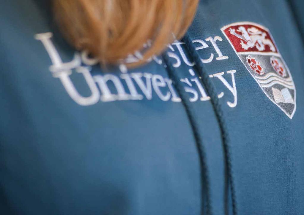
9 2.1 Primary logomark The logo is a visual shorthand for everything that the University represents. Maintaining its integrity is essential to symbolise the integrity of the University. Consequently the logo should be seen as a lock-up and the elements should never be separated or adjusted in size or relationship. The only instance this should ever be separated is when the minimum size is too small for a specific production. 9 The colours of the logo are important. Red provides a stand-out factor, grey provides a softer element and white ensures a clean, crisp feel. The Lancaster University wording should appear to the left of the symbol at all times. This should not be moved or amended in any way. In certain circumstances the secondary logomark may be used depending on the application please contact the Marketing Team to discuss this alternative. marketing-services@lancaster.ac.uk

10 2.2 Reversed out logomark The reversed out logomark has been created to use on darker backgrounds or for use over photographic backgrounds. This should be chosen when it will give a cleaner and more impactful result than using the primary logomark. In this version of the logo, there has been an additional grey stroke applied to the edge of the shield to help it become prominent. NB: Remember always to reproduce the logomark from high quality original artwork. Do not attempt to redraw any of the elements. All artwork can be obtained from the Marketing Team. marketing-services@lancaster.ac.uk 10
11 2.3 Mono logomark The mono version of the logomark is available in both black and white. This version will probably not be used very much, but is ideal for purposes such as branded promotional items where there may be a restriction on the amount of colours used due to the production process. NB: Remember always to reproduce the logomark from high quality original artwork. Do not attempt to redraw any of the elements. All artwork can be obtained from the Marketing Team. marketing-services@lancaster.ac.uk 11
12 2.4 Protecting the logomark The University logomark is always the hero and its integrity and legibility must never be compromised. To maximise the visibility and impact of the logomark, a protective clear zone must always exist around it. No other graphic elements should be allowed within this zone. It is established using the height of the logomark (U). This is the minimum recommended area, and more space around the logotype will improve its visibility. NB: Remember always to reproduce the logomark from high quality original artwork. Do not attempt to redraw any of the elements. All artwork can be obtained from the Marketing Team. marketing-services@lancaster.ac.uk 12
13 2.5 Minimum size 10mm height In print media, the Lancaster identity should never be shown any smaller than the size indicated here. This is the smallest size to which the shield can be reduced due to the level of detail, without losing integrity or becoming illegible or distorted. For further clarification on this please contact the Marketing Team. In certain instances Lancaster University primary identity may have to be reduced to a simple plain text version. This may be due to a restriction in a production process or material in which it is being applied. 13


14 2.6 Logo for promotional materials There cannot be a defined logo for promotional items, there just has to be good judgement and common sense. The priority has to be legibility of the brand identity so it shouldn't appear too small. This can be a problem for individual departments if the name of the department is very long e.g Lancaster Institute for the Contemporary Arts. If this is the case we recommend using only the University brand. The correct identity should also be used in order to make sure there is enough contrast between the product and the chosen brand identity. For further clarification and a list of the approved suppliers, please contact the Marketing Team. marketing-services@lancaster.ac.uk 14

15 2.7 Misuse of the logomark In order to maintain the integrity of the Lancaster University logo, please avoid the mistreatments shown on this page. The shield must not be manipulated or distorted in any way. The correct logomark must be used depending on the background it is intended to be used on. Common sense shows that the black text is not readable if sat on a dark photographic background. NB: Remember always to reproduce the logomark from high quality original artwork. Do not attempt to redraw any of the elements. All artwork can be obtained from the Marketing Team. marketing-services@lancaster.ac.uk 15
16 2.8 Crest colour palette Pantone Process Black Pantone 1807 Cyan 0% Magenta 100% Yellow 96% Black 28% Pantone 429 Cyan 3% Magenta 0% Yellow 0% Black 32% Lancaster s logo colours are red, grey, white and black. The pantone colours are as follows: Red: Pantone 1807 Grey: Pantone 429 Black: Pantone Process Black 16

17 3 The University look and feel 17
18 3.1 Typography Lexia Aktiv Grotesk Effra Three typefaces have been chosen to represent Lancaster University s look and feel. These typefaces are for use in all printed marketing materials and digital artwork. The use of a slab and a sans serif typeface is important as it provides depth to the Lancaster personality. A slab serif typeface helps to provide gravitas and authority, while a sans serif typeface is clean, modern and is easy to read as body copy. Effra, Lexia and Aktiv Grotesk are the chosen typefaces and are all available through Adobe Typekit subscription. These are not available to staff and will require a professional design agency. 18
19 3.1.1 Typography LexiaLight Regular Thin Bold XBold Black $%^&*()_+ ABCDEFGHIJKLMNOPQRSTUVWXYZ abcdefghijklmnopqrstuvwxyz Lancaster is one of the best universities in the UK on any objective measure: that s why we re consistently ranked amongst the top 10. Some of our greatest strengths include overall student satisfaction and employment, so you ll have a great time here and graduate with strong employment prospects. For Headings Lexia is a slab serif font with a wide range of styles, weights and uses. It was designed with traditional proportions to give it the best functionality possible and is easily readable at small sizes. At large sizes, its Advertising weight displays this font family s individuality to great effect. For designers working with tough composition issues, one of Lexia s great benefits is its extended range of weights and styles. The mid weights provide excellent legibility for text, whilst the extreme weights are expressive and perfect for display and titling. Lexia even includes an Advertising weight that can be used to make impact on billboards and other large scale applications. This font is perfect for conveying punchy messages on a massive scale or simply communicating clearly at text sizes. Lexia is a great all-rounder with superb functionality. 19
20 3.1.2 Typography EffraLight Regular Medium Bold Heavy $%^&*()_+ ABCDEFGHIJKLMNOPQRSTUVWXYZ abcdefghijklmnopqrstuvwxyz Lancaster is one of the best universities in the UK on any objective measure: that s why we re consistently ranked amongst the top 10. Some of our greatest strengths include overall student satisfaction and employment, so you ll have a great time here and graduate with strong employment prospects. For Headings With clean lines and humanist character shapes, Effra is a supremely flexible sans serif font family that has become a design favourite in recent years. It solves everyday design and communication problems by providing a unique look-and-feel that can be applied to a wide range of media. With clean lines and open character shapes, Effra is a family that combines definite personality with simplicity of form. It s an attractive combination that makes Effra flexible and, although it is optimized for titling sizes between 12pt and 16pt, it s equally at home when used for large headlines or small body copy. Effra is available in five weights with matching Italics, creating carefully stepped changes that allow for intelligent designs in a wide range of media. 20
21 3.1.3 Typography Aktiv Grotesk Hairline Light Regular medium Bold XBold Black $%^&*()_+ ABCDEFGHIJKLMNOPQRSTUVWXYZ abcdefghijklmnopqrstuvwxyz Lancaster is one of the best universities in the UK on any objective measure: that s why we re consistently ranked amongst the top 10. Some of our greatest strengths include overall student satisfaction and employment, so you ll have a great time here and graduate with strong employment prospects. For Bodycopy Grotesque fonts have been hugely popular over the past fifty years, with designers and font-users choosing them for their neutrality, contemporary feel, utilitarianism, and seriousness; these are fonts which can be successfully applied in a broad range of contexts and media. 21
22 3.2 Primary colour palette The Lancaster University primary colour palette retains the historical ethos of Lancaster, which we feel is very important to the brand. The colours are confident and strong, and help Lancaster retain its image of a top 10 university. We have evolved the palette slightly by adding in an additional grey into the primary palette. More importantly the Lancaster University brand now has a secondary colour palette. This new addition offers more flexibility, and shows the Lancaster University personality. See the secondary colour palette on page
23 3.2 Primary colour palette Pantone 1807 Pantone 429 Pantone 432 Cyan 0% Magenta 100% Yellow 96% Black 28% Cyan 3% Magenta 0% Yellow 0% Black 37% Cyan 0% Magenta 0% Yellow 0% Black 80% R 181 G 18 B 27 HEX: b5121b R 190 G 192 B 194 HEX: bec0c2 R 85 G 86 B 86 HEX: The Lancaster University primary colour palette retains the historical ethos of Lancaster, which we feel is very important to the brand. The colours are confident and strong, and help Lancaster retain its image of a top 10 university. We have evolved the palette slightly by adding in an additional grey into the primary palette. More importantly the Lancaster University brand now has a secondary colour palette. This new addition offers more flexibility, and shows the Lancaster University personality. See the secondary colour palette overleaf. 23
24 3.3 Secondary colour palette Pantone 5555 R 85 G 120 B 105 Cyan 52% Magenta 7% Yellow 36% Black 29% HEX: Pantone 327 R 0 G 136 B 120 Cyan 100% Magenta 14% Yellow 60% Black 5% HEX: Pantone 3258 R 72 G 182 B 173 Cyan 68% Magenta 2% Yellow 38% Black 0% HEX: 48B6AD Pantone 7707 R 0 G 99 B 130 Cyan 80% Magenta 0% Yellow 0% Black 57% HEX: Pantone 2377 R 50 G 65 B 71 Cyan 75% Magenta 54% Yellow 47% Black 44% HEX: Pantone 7493 R 134 G 153 B 120 Cyan 30% Magenta 7% Yellow 35% Black 10% HEX: Pantone 346 R 116 G 192 B 153 Cyan 58% Magenta 0% Yellow 50% Black 0% HEX: 75BF9A Pantone 5503 R 128 G 184 B 188 Cyan 54% Magenta 12% Yellow 27% Black 0% HEX: 81B8BB Pantone 643 R 196 G 218 B 229 Cyan 27% Magenta 7% Yellow 9% Black 0% HEX: C4DAE5 Pantone 550 R 127 G 170 B 190 Cyan 50% Magenta 15% Yellow 15% Black 2% HEX: 7faabe Pantone 459 R 227 G 203 B 139 Cyan 13% Magenta 18% Yellow 52% Black 1% HEX: e3cb8b Pantone 7661 R 100 G 96 B 108 Cyan 22% Magenta 25% Yellow 3% Black 45% HEX: 64606c Pantone 178 R 255 G 115 B 114 Cyan 0% Magenta 68% Yellow 45% Black 0% HEX: FF7372 Pantone 689 R 138 G 62 B 101 Cyan 43% Magenta 82% Yellow 31% Black 20% HEX: 8A3E65 Pantone 7535 R 186 G 182 B 162 Cyan 22% Magenta 18% Yellow 30% Black 10% HEX: bab6a2 Pantone 7411 R 225 G 171 B 108 Cyan 11% Magenta 36% Yellow 62% Black 1% HEX: e1ab6c Pantone 7607 R 194 G 103 B 99 Cyan 0% Magenta 63% Yellow 39% Black 20% HEX: c26763 Pantone 1625 R 249 G 169 B 142 Cyan 0% Magenta 43% Yellow 42% Black 0% HEX: F9A98E Pantone 7654 R 164 G 118 B 154 Cyan 41% Magenta 59% Yellow 20% Black 3% HEX: A4769A Our secondary colours have been chosen to bring a bit of life and personality, yet still remain classic and tasteful. The muted palette helps support the vibrant red from the primary palette. This palette can be used in combination with the primary colour palette to introduce subtlety and variety to certain applications. They too must be used carefully to compliment and enrich the Lancaster University identity. The colours help break down the corporate red and grey, are perfect for design layouts if there is a call to action or infographic. When text is overlaid on a coloured background we recommend it needs to be at least 95% black or white as shown above to create as much contrast as possible and ensure legibility. 24
25 3.4 The branding hierarchy Standard department and research centre brands Approved sub-brands Top level The Lancaster University brand has to work both externally and internally. The brand therefore has to have the flexibility to be adapted to suit the correct audience. At school level the shield is still used but the emphasis is more on the faculty name rather than the University brand. At department level, there is more of an even balance between the University brand and the department name. This arrangement is also the basis for any other third party/affiliated organisations. These rules should be applied throughout the University to help deliver a cohesive and professional brand. 25
26 3.5 The curved corner Work placements All our courses are offered as a three year BEng degree or a four year MEng degree and all have the option of spending a year in industry. Fig 1 Fig 2 The use of a curved corner has been introduced to create a distinctive feature to colour blocks and picture boxes. The curved corner can be used in conjunction with square boxes to give a sharper feel, however the curved box should always end to the right and to the bottom of any arrangement. When using a strip of images in a horizontal fashion, the curved corner should be used on the bottom right hand side, see fig 1. Images can be used in a grid system but please ensure that the curved image is placed in the bottom right hand corner, see fig 2. 26

27 3.6 Paper stock The paper stock is crucial to help retain consistency of quality feel, and replication of colour. For the top level documents, thus far, the University uses UPM Fine in a variety of weights. UPM Fine is an offset paper that provides high brightness, optimal opacity and outstanding suitability for processing. It s a flexible multi-use paper making it ideal for flyers, prospectuses, and magazines that the University produce. For further technical information see: 490®ion=EMEA&language=en-gb 27
28 4 Photography 28


29 4.1 Photography Lancaster is a very photography rich university and the brand style tries to capture all aspects of campus, staff and student life. The photography style adopted by Lancaster University is very relaxed, authentic and documentary, as much as possible. For environmental campus shots, using both wideangle images (highlighting the breadth of campus) in conjunction with close-ups (showing unique details and interesting perspectives) works best. The campus is forever changing and new buildings appear every year, so it's important that up-to-date photography is used. It is important that all photography is consistent and to the same high standard. For access to the media library or for a list of approved photographers contact the Marketing Team. marketing-services@lancaster.ac.uk 29


30 4.1 Photography City and campus We want Lancaster University to be a unique proposition, in a very crowded market place. Many other universities look the same so it's important to show what makes Lancaster different images that show the campus in context to its location of the historic city of Lancaster and the North West work best. Lancaster is unique as it offers a fantastic campus life, within a small but exciting city. It is important to find these unique aspects of the city and the architecture to mirror the new modern developments on campus. The photography of Lancaster plays a key part in our brand and helps put the University on the map. 30


31 4.1 Photography Buildings Lancaster University has invested over 500 million on campus developments since 2003 and the buildings and facilities are an integral part of our brand. These help enforce our Top 10 status to potential students and show that Lancaster is an evolving university. Photography for these areas should be shot with geometry being the main aim, to help reflect the strength and confidence of the Lancaster campus. It is also important that people are in the shots, in order to show the atmosphere and vibrancy of campus life. Having clear, dry weather is essential for consistency. Photographers should use the above examples as a guide for what to focus on and have to achieve straight lines for consistency when geographical location is an issue. 31


32 4.1 Photography People Both students and staff are key to the success of Lancaster University so it is crucial that they are shown in the correct manner. All people photography should be shot in a way that shows collaboration, engagement and interaction with their environment. It is also very important that you pick the correct photography in context of its publication/usage. Photographers and designers should show an appreciation of ethnicity and international cultures. 32 Examples of this include the following: No semi-naked people in the swimming pool No excessive alcohol abuse No couples in intimate environments, e.g bedrooms No overly revealing clothing, eg. low cut tops or very short skirts For clarification on this contact the Marketing Team. marketing-services@lancaster.ac.uk


33 4.1 Photography Portraits On some occasions key staff require portrait/headshots to be taken. To keep the consistency of style these should be taken in well-lit environments, ideally with natural lighting. Picking the correct location is crucial in order to make staff feel relaxed and as natural as possible. For knowledge of these key locations within campus please contact the Marketing Team. 33

34 5 Digital communications 34
35 5.1 Social media In order to avoid degradation or improper treatment of the Lancaster brand these guidelines should be followed to ensure that representation of the University brand on third-party social media platforms is appropriate. The avatar that is used is consistent across all our social media channels. See page 37 for further details. All the Lancaster profiles, and background images should have a consistent feel across all social media channels, as these are an extension of the University website. These are social media accounts, so please consider the social personality you want your aesthetic to convey. Of course the University is an organisation of outstanding achievements but don t be afraid to have fun! 35


36 5.1 Social media Twitter Crest only Facebook The profile picture/avatar for all social media channels should always be the Lancaster University crest. This is to be used without the wordmark in order to maximise the visual presence. See the screenshots above for social media examples. For artwork files please contact the Marketing Team. 36
37 5.1 Social media Twitter Guidelines Avatar Use the shield cropped to 70 pixels x 70 pixels. Background Use a textural image cropped to 1600 pixels x 1200 pixels. Avoid busy, repeating backgrounds. Be as specific and descriptive as possible within the 20-character limit. Use the name of your department, school, or organisation. Do not use Lancaster University alone. Facebook Guidelines Profile picture Use an iconic photograph cropped to 200 pixels wide (no height constraint). Avoid using words or solid colors as they degrade when rendered by Facebook. Vanity url This can never be changed, so choose carefully. Consider establishing a consistent naming convention, for example: twitter.com/lancasteruni, facebook.com/ lancasteruniversity Page type Under Official Page, select Local Business and then Education. Timeline cover photo The first thing visitors to your timeline see, the cover photo should be engaging, easy to read, and sized 851 x 315 pixels. 37

38 6 Templates
39 6.1 Templates Templates make it easier to produce items within the brand guidelines. Please use the variety of Word and Powerpoint templates available here for both Lancaster University and departmental templates. If you regularly produce a specific piece of collateral which does not have an associated template, you may benefit from having a template produced. Please contact the Marketing Team marketing-services@lancaster.ac.uk to discuss the production of new templates to meet your needs. 39
40 Thank you
- BRAND BOOK - - BRAND BOOK -
 - BRAND BOOK - - BRAND BOOK - INTRODUCTION These guidelines have elements to assist in applying the Clare Tourism brand. The guides apply to the logo, typeface, colours and additional elements which combine
Brand Identity Guidelines. v1.3 /
 Brand Identity Guidelines v1.3 / 10.07.09 Contents 1.1 About L2P... 1.2 Introduction... 1.3 The L2P Visual Identity... 1.4 The L2P Brandmark... 1.5 Colour... 1.5 Greyscale & reversed... 1.6 Colour configurations...
2014 Brand Guidelines
 01 Contents 02 Introduction 03-05 Homecoming Scotland Master Logos 06 Promotional Logos 07 Logo Exclusion Area and Minimum Size 08 Logo Distortion Illustration 09-10 Colour Specification (Print and Online)
ADIA MEMBER MARKETING GUIDE. How using ADIA branding will help grow your business
 ADIA MEMBER MARKETING GUIDE How using ADIA branding will help grow your business CONTENTS ADIA membership benefits that support your business 3 Why and where to use the ADIA member logo 4 The ADIA member
Identity Guidelines august 2009
 Identity Guidelines august 2009 Contents Introduction.... 2 Color palette... 3 Identity size and control area... 5 Identity use with other logos.... 6 Identity variations... 7 Identity don ts... 8 Typography....
WENDY. School of Dance BRUSH STROKE CONCEPT GUIDE
 BRUSH STROKE CONCEPT GUIDE CONTENTS Re-brand 2017 BACKGROUND INFORMATION 3 LOGO EQUITIES 6 APPLICATION METHODS 21 inspiration behind the concept name primary logo positive/negative logo colour palette
Brand Story. Girl Talk began in 2002 when one high school girl identified a problem and decided to make a difference Brand Messaging.
 Brand Guidelines 01 2 Brand Messaging Guidelines Brand Story Girl Talk began in 2002 when one high school girl identified a problem and decided to make a difference. Haley Kilpatrick founded the first
02 WE ARE EVERYDAY ADVENTUREWEAR BORN FROM NEW ENGLAND CHARLES RIVER APPAREL
 BRAND GUIDELINES 02 WE ARE EVERYDAY ADVENTUREWEAR CHARLES RIVER APPAREL BORN FROM NEW ENGLAND OUR STORY 03 EVERYDAY ADVENTUREWEAR BORN FROM NEW ENGLAND It all started with a rain jacket in 1983 - not just
LAW WEEK LOGO USE: Guidelines for Event Partners. Using this guide. Further information
 LAW WEEK LOGO USE: Guidelines for Event Partners STOP! Did you receive a Law Week Grant from Victoria Law Foundation? Then you re reading the wrong guidelines! You need to acknowledge your event s grant
Welcome to the team! TOGETHER, WE WILL TURN MOTIVATED GIRLS INTO UNSTOPPABLE WOMEN.
 BRAND GUIDELINES Welcome to the team! TOGETHER, WE WILL TURN MOTIVATED GIRLS INTO UNSTOPPABLE WOMEN. Play Like a Girl is a nonprofit organization dedicated to empowering girls ages 9-13 to reach their
Why do we need guidelines?
 Interactive Eyewear of the Future Style Guide Why do we need guidelines? Our values should be evident wherever VizCOM is encountered, whether online or via traditional marketing material. If we follow
BRANDMARK GUIDELINES
 GUIDELINES 1.1 BRANDMARK RATIONALE The brandmark is inspired by the spirit of partnership. It aims to capture through its design Rawabi Holding s unique ability to bring together marketing intelligence
Guidelines for Law Week Grant recipients
 LAW WEEK LOGO USE: Guidelines for Law Week Grant recipients STOP! These guidelines are for Event Partners who received a Law Week Grant in 2018. If this is not you, you re reading the wrong guidelines!
INTRODUCTION... 3 INSPIRATION... 6 LOGOTYPES LOGOTYPES /AMATEUR SPORTS LOGOS TYPOGRAPHY INTRODUCTION COLOR PALETTE...
 B R A N D S T Y L E G U I D E TABLE OF CONTENTS FLORIDA SPORTS FOUNDATION GUIDELINES INTRODUCTION............................................................... 3 INSPIRATION...............................................................
Oklahoma Wesleyan University Eagles Athletics Branding & Identity Style Guide
 Oklahoma Wesleyan University Eagles Athletics Branding & Identity Style Guide version 3/15/17 prepared by Megan England Media Relations & Brand Management Office of University Relations table of contents
BRANDMARKS 1 BRAND GUIDELINES // 2019
 1 BRAND GUIDELINES // 2019 TABLE OF CONTENTS 4. LOS ANGELES AUTO SHOW BRAND GUIDELINES 6. Brandmarks 12. Color Palettes 13. Fonts 14. AUTOMOBILITY LA BRAND GUIDELINES 16. Brandmarks 22. Color Palettes
Brand Guidelines March Zechariah Vision Network
 Brand Guidelines March 2015 Contents / 1 Thriving by Involving Who We Are.................... 2 Contents About the Logo................. 3 Logo Variations................. 4 Using the Logo.................
SHAPE America. Society of Health and Physical Educators BRAND GUIDELINES
 SHAPE America Society of Health and Physical Educators BRAND GUIDELINES SHAPE America Society of Health and Physical Educators Table of Contents INTRODUCTION 3 TELLING OUR BRAND STORY 4 Brand Personality
Creative Narrative & Graphic Elements:
 CREATIVE STYLE GUIDE UNIVERSITY OF VERMONT Creative Narrative & Graphic Elements: STYLE GUIDE VOL. 1.2 CREATIVE STYLE GUIDE 1.2 INTRODUCTION Introduction In an effort to provide a resource that will aid
OBJECTIVE & STRATEGY STRATEGY OBJECTIVE
 Kyle Rush VIS9 OBJECTIVE & STRATEGY STRATEGY OBJECTIVE will bring a bold and new experience to the music lover who enjoy exploring new music. will be engaging and unexpected. We want our site to stand
Promotional Item Brand Standards
 Promotional Item Brand Standards June 1, 2014 1 2 Welcome to the Niagara College promotional item brand standards. This document has been developed to provide the Niagara College community with specific
Windmill Hill City Farm
 Windmill Hill City Farm Logo guidelines August 2011 These guidelines will be of interest to Windmill Hill City Farm staff and any external personnel working on graphic design for the farm. If you have
Portfolio Hannah O Mahony
 Hello, My name is and I am passionate about design. Here is a small sample of some selected work to date. I love what I do and I hope you do too. If so please contact me by phone or e-mail. Enjoy. m: 0449
Logo Specifications: *U.S. Only. Crawford Logos Roll Out - Marketing Conference, June 2013 Open Globe / Division Logo Lockup
 *U.S. Only Crawford Logos Roll Out - Marketing Conference, June 2013 Open Globe / Division Logo Lockup Logo Specifications Accent Colors: GTS: Pantone 144C Contractor Connection: Pantone 124C SWS: Pantone
Real Estate One Franchise Brand Guidelines
 Real Estate One Franchise Brand Guidelines 1 2 Table of Contents 4 8 14 20 26 30 Introduction Logos Typography Colors Photography Social Media 3 About Real Estate One Clients receive quality, family-grown
Traditional Owner Acknowledgement Brand
 Traditional Owner Acknowledgement Brand Traditional Owner Acknowledgement Brand Red Cross acknowledges the Traditional Owners of this land, their ancestors and Elders, past and present. Brand Symbolism
Max Broock Brand Guidelines
 Max Broock Brand Guidelines 1 About Max Broock Clients receive quality, family-grown service when working with our family of companies. Serving our state for almost 125 years, Michigan is more than our
PIEDMONT ATHLETICS BRAND IDENTITY GUIDELINES
 2017 PIEDMONT ATHLETICS BRAND IDENTITY GUIDELINES E S T. 1 9 2 1 PIEDMONT ATHLETICS BRAND IDENTITY The Piedmont High School athletic branding package provides the Athletic Department with consistent visuals
Food Brand Ireland. Una FitzGibbon August 30 th Growing the success of Irish food & horticulture
 Food Brand Ireland Una FitzGibbon August 30 th 2011 AIDAN COTTER CHIEF EXECUTIVE BORD BIA 28 JANUARY 2009 Brand What do we mean by Brand? BRAND = REPUTATION What do we mean by Umbrella Brand? UMBRELLA
Merchandise. Standards Guide
 Merchandise Standards Guide Last updated January 2018 The Ivey Brand Through the use of the Ivey brand we communicate to the world our tradition of excellence, innovation and educating leaders and future
Using the logo on University merchandise and gifts
 Division of Corporate Affairs and Planning VISUAL IDENTITY GUIDE NUMBER 5 Using the logo on University merchandise and gifts www.le.ac.uk/marketing 2 UNIVERSITY OF LEICESTER DIVISION OF MARKETING AND COMMUNICATIONS
September 2014 BRAND GUIDELINES
 September 2014 BRAND GUIDELINES PRIMARY MARK PRIMARY MARK WITH B SECONDARY MARK, INTERLOCKING BU WORD MARK The new trademark Brenau University Golden Tigers logos are available for use in all authorized
Delivery partnership guidelines. Version
 Version 2.0 11.03.16 2 Introduction We re thrilled to team up to give your customers a great delivery experience. The guide includes details on the Uber delivery mark as well as usage standards that can
The canon of graphic design: Paula SCHER, essay written by kassy bull, graphic design, 1st year.
 The canon of graphic design: Paula SCHER, essay written by kassy bull, graphic design, 1st year. Who are the graphic designers practicing today that will be remembered in 20 years time? Why will they be
Graphic Design Trends Colorwhistle.com
 Graphic Design Trends 2019 Welcome to our most popular yearly edition of Graphic Design Trends for the upcoming year. 2018 was a year where taking risks in design were considered normal and part of the
Higher National Unit Specification. General information for centres. Fashion: Commercial Design. Unit code: F18W 34
 Higher National Unit Specification General information for centres Unit title: Fashion: Commercial Design Unit code: F18W 34 Unit purpose: This Unit enables candidates to demonstrate a logical and creative
37,097. We Analyzed Design Requests. Here Are The Hottest Business Graphic Design Trends for 2018
 Here Are The Hottest Business Graphic Design Trends for 2018 37,097 We Analyzed Design Requests. As of April 2018, Design Pickle had created 37,097 unique design requests for our clients in 2018 so far.
Colour. An important part of brand integrity is the accurate and. consistent reproduction of brand colours. This page outlines
 Colour An important part of brand integrity is the accurate and OPG STEEL BLUE consistent reproduction of brand colours. This page outlines Pantone 7691 U Pantone 7691 C Too Blue P37H7 and Vinyl equivalents.
GIFT IT NOW BRAND. vibrant, lively, exciting and adventurous
 BRAND GUIDELINES GIFT IT NOW BRAND vibrant, lively, exciting and adventurous The Gift It Now brand is a fun, vibrant and energetic consumer brand making gift-giving fun. With a colourful design that emulates
Logo Use and Guidelines for Approved Nevada Health Link Partners
 Logo Use and Guidelines for Approved Nevada Health Link Partners August 12,2014 - Version 1.2 Nevada Health Link: Partner Logo Use Standards 1 Partner Use of the Nevada Health Link In an effort to provide
BITE INTO BITE CORPORATE STYLE GUIDE
 BITE INTO BITE CORPORATE STYLE GUIDE CONTENTS ABOUT US...1 OUR HISTORY...1 OUR MISSION...2 OUR FANS...3 CHANNELS...4 VISUAL IDENTITY...5 BRAND LOGO...5 COLOUR PALETTE...6 TYPEFACE...7 TONE AND VOICE...8
Make Chicago the Top Global Destination.
 Styleguide our vision our mission Make Chicago the Top Global Destination. The Chicago Convention & Tourism Bureau is the premier sales and marketing organization that promotes Chicago s world-class assets
Add to Apple Wallet. Guidelines March 2017
 Add to Apple Wallet Guidelines March 2017 Contents Add to Apple Wallet Overview 3 Graphic Standards 4 Examples 5 Do s and Don ts 6 Printing the Add to Apple Wallet Button Requirements 7 Codes 8 Button
BRANDGUIDE. Miami Trace Local Schools Brand Guidelines Primary logo and identification guidelines
 BRANDGUIDE Miami Trace Local Schools Brand Guidelines 2015 Primary logo and identification guidelines our brand our vision our future panther pride 01 why a re-brand? The Miami Trace Local School District
Cloudera Partner Guidelines Version 1.0. Brand Guidelines Partner Branding
 1 Brand Guidelines Table of Contents Introduction.... 03 Co-Branding..... 04 Program Branding.... 06 Color Palette.... 10 Conclusion / Contact.... 11 3 Co-branding shows a relationship between Cloudera
Oakgrove School. Uniform Policy
 Oakgrove School Uniform Policy ADOPTION AND AMENDMENTS TO UNIFORM Written September 2009 Section Whole Document Governors Meeting or Committee Curriculum 23 September 2009 Page and Year of Minute Curriculum,
18 February. Consumer PR HAN GAO
 EASTPAK UK SOCIAL MEDIA METRICS REPORT 18 February Consumer PR HAN GAO 1 INDEX Terms of reference page 3 Social Media activity page 5 What has been tracked and measured page 8 Results page 10 Conclusions
HEADSHOTS by Hayne Photographers
 HEADSHOTS by Hayne Photographers - PAGE 2 - - PAGE 3 - Hayne Photographers If you re looking for commercial or corporate portraits in Virginia and if you don t want to have another boring business portrait.
Provider toolkit. A guide to using the National Cervical Screening Programme & BreastScreen Aotearoa resources VERSION 1 SEPTEMBER 2017
 Provider toolkit A guide to using the National Cervical Screening Programme & BreastScreen Aotearoa resources VERSION 1 SEPTEMBER 217 1 National Cervical Screening Programme & BreastScreen Aotearoa provider
Glossier is an up-and-coming makeup and skincare brand that celebrates real girls, in real life.
 identity Glossier is an up-and-coming makeup and skincare brand that celebrates real girls, in real life. RATIONALE Glossier built its lines based on input collected from cool girls around the world to
PORTFOLIO GRAPHIC DESIGNER & ART DIRECTOR
 PORTFOLIO GRAPHIC DESIGNER & ART DIRECTOR LOGOs IDENTITY / LOGO All of my logo designs for my various clients. BEAM LOGO / IDENTITY BEAM is a piece of technology that enables global payments between mobile
Rock Only Visual Identity Standards
 Rock Only Visual Identity Standards August 2007 Table of Contents Logo Standards and Guidelines Rock Only logo.......................................................................... 1 Rock Only logo
2017 Button Up Vermont Brand Guidelines. Vermont Energy Investment Corporation 2017 Designed with Tammarck Media Cooperative & Alder Studio
 2017 Button Up Vermont Brand Guidelines Vermont Energy Investment Corporation 2017 Designed with Tammarck Media Cooperative & Alder Studio Use these tools! In 2016, Vermont Energy Investment Corporation
HyperSound copyright & brand guidelines
 HyperSound copyright & brand guidelines ii Copyright & brand guidelines Table of Contents Introduction......................................... 1 General Marketing Guidelines......................... 2
media pack 2017 WOMENSWEAR BUYER wwb-online.co
 WOMENSWEAR BUYER wwb-online.co The industry s essential business title WWB is dedicated exclusively to the womenswear industry. With a print circulation covering more than 7,000 retailers, buyers, manufacturers,
Provider toolkit. A guide to using the BreastScreen Aotearoa resources. 1 BreastScreen Aotearoa provider toolkit
 Provider toolkit A guide to using the BreastScreen Aotearoa resources 1 BreastScreen Aotearoa provider toolkit VERSION 1 JUNE 217 Introduction This is the new visual identity for BreastScreen Aotearoa.
FF: Fashion Design-Art (See also AF, AP, AR, DP, FD, TL)
") FF: Fashion Design-Art (See also AF, AP, AR, DP, FD, TL) FF 111 Visual Design Concepts I This course teaches students to understand, analyze, and draw the female fashion figure, front, turned, and back
FF: Fashion Design-Art (See also AF, AP, AR, DP, FD, TL) FF 111 Visual Design Concepts I This course teaches students to understand, analyze, and draw the female fashion figure, front, turned, and back
media pack 2018 WOMENSWEAR BUYER wwb-online.co
 WOMENSWEAR BUYER wwb-online.co The industry s essential business title WWB is dedicated exclusively to the womenswear industry. With a print circulation covering more than 7,000 retailers, buyers, manufacturers,
Fabric for Fashion / Clive Hallett & Amanda Johnston
 Activities Introduction: Introducing colour Activity 1: Creating a colour palette in response to an identified market Activity 2: Creating a colour palette for a young and dynamic sports brand Section
Hennepin County Brand Guidelines
 Brand Guidelines Hennepin County Brand Guidelines November 2016 Hennepin County Communications 612-348-3848 hennepin.us/brand Building our brand Everything and everyone has an identity what we look like,
Cut the Chaos, Keep the Kids.
 TABLE OF CONTENTS COLOR PALETTE SUGGESTED CONTRAST Cut the Chaos, Keep the Kids. LOGO VARIATION ABOUT THE LOGO INSPIRATION GUIDELINE FOR LOGO PLACEMENT TYPOGRAPHY PROBLEMS SOLVED BRAND PERSONALITY ABOUT
big brand book The Brand
 2 big brand book The Brand Our Ambition /6-7 The British Indigo Man /8-9 We Make More Than Clothing /10-11 The Delight Is In The Detail /12-13 The Fun Is On The Inside /14-15 Our Values /16-23 The Housestyle
THE WORLD IN MEDIA KIT 2017
 THE WORLD IN MEDIA KIT 2017 TheAmbitionista.com is about re-imagining what it means to be a smart, savvy and stylish woman working her way to the top. Yes, it is a fashion, beauty and lifestyle blog, but
KonMari Media Case Study
 KonMari Media Case Study Offices San Francisco Lahore Phuket Contact punch-agency.com start@punch-agency.com (855) 444 3303 KonMari Media A brand that speaks volumes You ve seen her book at airports, stores,
ITU s 150th Anniversary visual guidelines
 ITU s 150th Anniversary visual guidelines 150th Anniversary The 150th Anniversary kit of visual guidelines serves to promote activities related to ITU s 150th Anniversary. ITU membership and other stakeholders
Represent! Design Brief
 Represent! Design Brief Background People s History Museum (PHM) is the home of ideas worth fighting for where our radical past can inspire and motivate people to take action to shape a future where ideas
GRAPHIC DESIGN PORTFOLIO
 GRAPHIC DESIGN PORTFOLIO an old friend from high school AcneFree hasn t changed their visual identity for quite some time, so it was a no-brainer for me and two of my classmates to give the packaging a
mwb-online.co MEDIA PACK 2017
 mwb-online.co THE BUSINESS OF MENSWEAR MWB is the UK s only trade title dedicated exclusively to the menswear industry. Published 9 times a year, its readership covers the whole of the menswear trade in
Merchandise Standards / Correct Logo Usage
 Merchandise Standards / Correct Logo Usage The Cummins logo is the primary symbol for our brand. It should be reproduced accurately and kept isolated from other type and logos whenever possible. The logo
LOGO MANDATORY ASSIGNMENT 02 FOOD & MALT. LAURA KABELL LUNDBERG
 LOGO MANDATORY ASSIGNMENT 02 FOOD & MALT LAURA KABELL LUNDBERG https://laurakabell.wordpress.com/ INTRODUCTION A logo is what introduces the company and makes the customer remember the brand. A logo is
Ground and Letterforms
 round and Letterforms Idea I started the project with choosing the best letters I could came up with. The M and of course, representing my first name Mikaela and last name unnstedt. I must say it turned
mwb-online.co MEDIA PACK 2017/2018
 mwb-online.co THE BUSINESS OF MENSWEAR MWB is the UK s only trade title dedicated exclusively to the menswear industry. Published 6 times a year, its readership covers the whole of the menswear trade in
SAC S RESPONSE TO THE OECD ALIGNMENT ASSESSMENT
 SAC S RESPONSE TO THE OECD ALIGNMENT ASSESSMENT A Collaboration Between the Sustainable Apparel Coalition and the Organisation for Economic Cooperation and Development February 13, 2019 A Global Language
Flow at Anime Matsuri
 1 Welcome to my portfolio. This document is a representation of my work during my time in the academic, personal, and freelance fields. The works here are centered around the print industry, branding,
5 RAD STEPS SELECTION
 rad GRAD WEAR 5 RAD STEPS SELECTION Choose your garment style & fabric colour FRONT DESIGN Select the embellishment / print for the front of your garment BACK DESIGN Select the print for the back of your
Welcome to James Morton
 35 Welcome to James Morton James Morton has over 35 years experience supplying custom-made ties, scarves and other accessories to companies, sports clubs, schools and many other satisfied customers. With
UNIQLO UNIQLO, FUELING CLOTHING INNOVATION
 UNIQLO UNIQLO, FUELING CLOTHING INNOVATION 36 Seamless down has no stitches for the wind to get through so it is super warm. The durable water-repellent fabric and stylish silhouette are key to this product
Tea Towel Fundraising - Profitable, Healthy & Fun! Easy to run, everything is supplied and everybody loves them!
 Create childhood keepsakes to remember friends & teachers Earn up to 50% PROFIT! Your FREE Coordinator s Kit includes everything you ll need Tea Towel Fundraising - Profitable, Healthy & Fun! Easy to run,
Copyright 2017 Naturalislabs Pte Ltd. All rights reserved. Published by Eric Kelly.
 UltraFX10.com 1 Copyright 2017 Naturalislabs Pte Ltd. All rights reserved. Published by Eric Kelly. No part of this publication may be reproduced, stored in a retrieval system, or transmitted in any form
C O N C E P T U A L B R A N D S E D U C A T I O N P O R T F O L I O
 C O N C E P T U A L B R A N D S P O R T F O L I O 2 0 1 8 1. COLOUR CRAFT 1.0 Before you break the rules like an artistyou must learn the colour rules like a pro. Increase your knowledge to solve even
MRL Mutations. Mihrelle 2016
 MRL Mutations Mihrelle 2016 MRL Mutations This product is all about expanding possibilities. MRL Mutations is a toolset designed to enable you to push the boundaries of what is possible with Iray Character
STAN LANE. Graphic Designer Photographer Artist
 STAN LANE Graphic Designer Photographer Artist DEDICATED INNOVATIVE EDGY DEPENDABLE MOTIVATED I know I was put on this earth to be an artist. With a background in the military, obtaining strong values,
MARQUETTE CATHOLIC HIGH SCHOOL Graphic Standards A LT O N, I L
 HIGH SCHOOL 2016 Graphic Standards A LT O N, I L Marquett School gh atholic Hi C e A LT O N, I L Marquette s Graphic Identity Marquette Catholic High School in Alton, IL was established in 1927. In that
showcase 2012 contact us
 showcase 2012 contact us 31-35 Walsall Road, Willenhall, West Midlands WV13 2EG Tel: +44 (0)1902 366533 Fax: +44 (0)1902 366550 Email: sales@newdc.uk.com www.newdc.uk.com about us New Direction Clothing
Age Progression - Photoshop Tutorials
 Age Progression - Photoshop Tutorials Disclaimer: None of the given Photoshop Tutorials are written by me. They are all taken from various sources on the Internet and I compiled some of them for you. Hope
COMMUNICATION ON ENGAGEMENT DANISH FASHION INSTITUTE
 COMMUNICATION ON ENGAGEMENT DANISH FASHION INSTITUTE PERIOD: 31 OCTOBER 2015 31 OCTOBER 2017 STATEMENT OF CONTINUED SUPPORT BY CHIEF EXECUTIVE 31 October 2017 To our stakeholders, It is a pleasure to confirm
the DARING WAY SHOW UP BE SEEN LIVE BRAVE based on the research of Brené Brown
 the DARING WAY SHOW UP BE SEEN LIVE BRAVE based on the research of Brené Brown TRADEMARK and STYLE GUIDE These guidelines were established to ensure that all community members are familiar with the legal,
NATHAN JOHNSON APOSTOLIC CLOTHING
 NATHAN JOHNSON APOSTOLIC CLOTHING Analysis by Jacob Tapia Introduction The business analysis found in this review is intended to be a broad analysis of Nathan Johnson s business, Apostolicclothing.com.
Summer style: Be aware of what you wear to the office Vancouve...
 Summer style: Be aware of what you wear to the office ALEESHA HARRIS More from Aleesha Harris (HTTP://VANCOUVERSUN.COM/AUTHOR/ALEESHA2) Published on: June 20, 2016 Last Updated: June 20, 2016 2:28 PM PDT
University of Wisconsin-Madison Hazard Communication Standard Policy Dept. of Environment, Health & Safety Office of Chemical Safety
 University of Wisconsin-Madison Hazard Communication Standard Policy Dept. of Environment, Health & Safety Office of Chemical Safety 1.0 Introduction... 1 1.1 Purpose... 1 1.2 Regulatory Background...
Guidance to Applicants for Portfolio Programmes 2018
 Guidance to Applicants for Portfolio Programmes 2018 The Application Process: If you make an application to UCAS for one of the following programmes at Heriot-Watt s School of Textiles and Design at the
Brand Identity & Motion Graphics
 Reptile is a small independent creative studio working in the world of music, entertainment, fashion and lifestyle. From global brands to niche markets, our talented and friendly team helps companies communicate
JOB INFORMATION PACK GALLERY ASSISTANTS (CASUAL)
") JOB INFORMATION PACK GALLRY ASSISTANTS (CASUAL) The South London Gallery (SLG) is a locally, nationally and internationally recognised gallery with an acclaimed and award-winning education and outreach
JOB INFORMATION PACK GALLRY ASSISTANTS (CASUAL) The South London Gallery (SLG) is a locally, nationally and internationally recognised gallery with an acclaimed and award-winning education and outreach
BRAND USAGE GUIDELINES AND NAMING CONVENTIONS
 Tango Buenos Aires [ PRELIMINARIES ] BRAND USAGE GUIDELINES AND NAMING CONVENTIONS All public communication and dissemination material and media, including digital media, of the PRELIMINARY must comply
Wild Winter. Brand Standards Guide By Shelby Cunningham
 Wild Winter Brand Standards Guide By Shelby Cunningham 2 Table of Contents Contents 1. Introduction Pages 3-4 Page 13 5. Color System 2. Brand Positioning Pages 5-6 Page 14 6. Typography 3. Brand Voice
SAULT COLLEGE 443 NORTHERN AVENUE SAULT STE. MARIE, ON P6B 4J3, CANADA
 1 Course Code: Title Program Number: Name Department: Semester/Term: Course Description: : MAKE-UP ARTISTRY I 2017: ESTHETICIAN ESTHETICIAN 17F This course introduces the Professional Makeup Procedure
GRAPHIC IDENTITY LOGO
 LOGO The Oriental Institute logo is our identity. For an effective identity the logo should appear consistent throughout all print and digital communications. Logo Emblem Wordmark The Oriental Institute
How to check the printing process
 How to check the printing process Launch the checking process 1 Simulate the verification 5 Results interpretation 6 Standard constraints 7 Swatches 9 Standard interpretation 10 ISO 12647-2 Offset Simulation
Brand your blog. without spending a fortune. by Biz BFF
 Brand your blog without spending a fortune by Biz BFF step 1 - define your brand style What are some style words that fit your brand? (Circle any that you re drawn to and brainstorm your own!) modern vintage
FINE ARTS PORTFOLIO CAPSTONE PROJECT
 MACKENZIE MILLER FINE ARTS PORTFOLIO CAPSTONE PROJECT TABLE OF CONTENTS TITLE TABLE OF CONTENTS MUSIC/ABOUT THE ARTIST ELIGBILITY REQUIREMENTS ARTWORKS 1 // H A N D S 2 // J E W E L R Y 3 // F A B R I